← Explore Who Is DWJThe Lenox + Yale Agency ↗
The Lenox + Yale AgencyDesign Agency
Advertising / Design / Brand communication

Make the idea
impossible to miss.

Creative strategy for food + beverage brands, restaurants, and hotels. Explore independent concepts that connect a business message with what people notice, feel, and remember.

View selected work
Featured / Independent concept study

One image.
A complete guest experience.

Coca-Cola / Super Bowl hospitality concept
Campaign design / Creative remix / Guest touchpoints

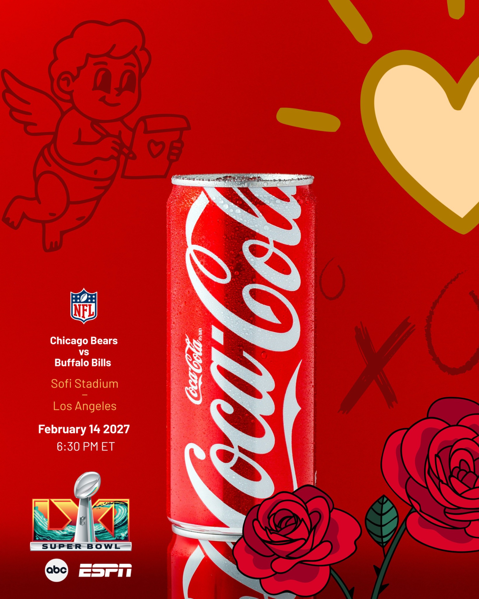
The idea: Give a product photograph a game-day story, then carry that story into a suite-holder experience.
Our approach: We added event typography and Valentine imagery to the red-can composition, then applied the campaign to credentials, lanyards, and suite materials.
The work: Source photograph, promotional graphic, and a hospitality application mockup.
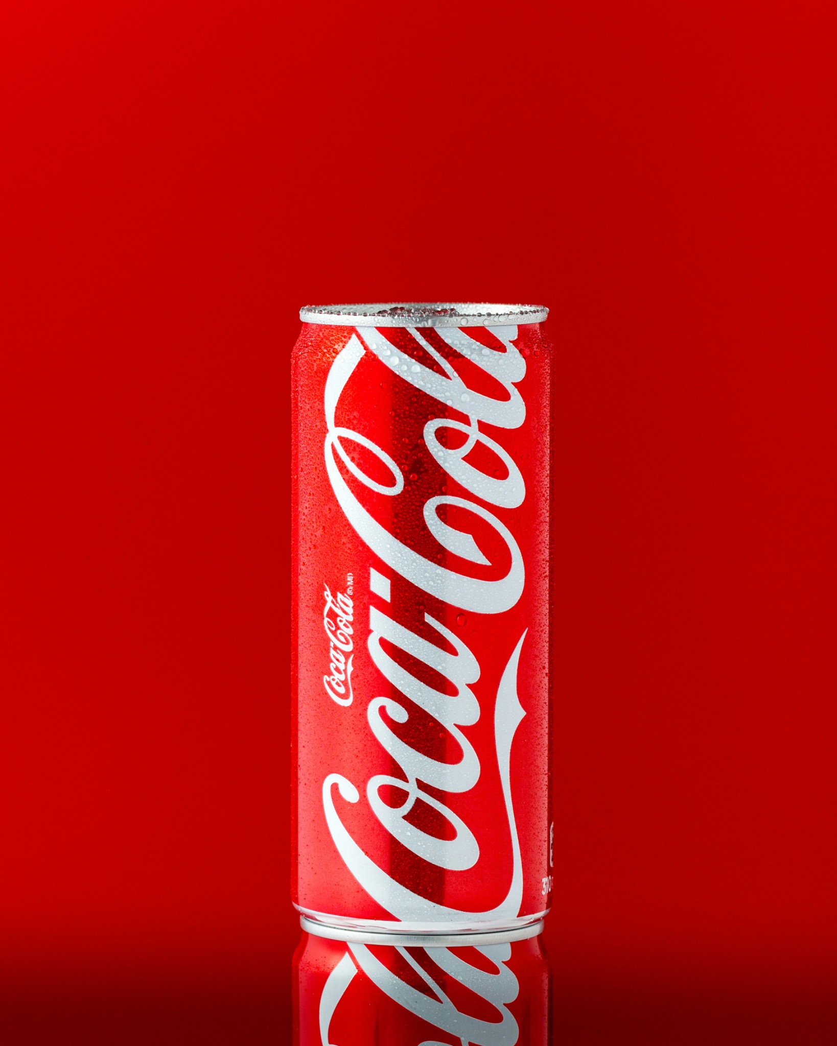
Original unaltered photograph of a Coca-Cola can on a red background
01The original photograph. The supplied product image before our graphic remix. Photography: Mae Mu / Unsplash.
Remixed Coca-Cola promotional concept with football event details, roses, hearts, and Cupid illustration
02The campaign remix. Event copy and Valentine imagery build a new narrative around the original product photograph.
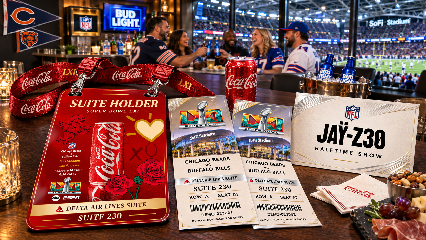
Suite-holder application mockup showing Coca-Cola credentials and lanyards, guest tickets, and coordinated suite materials
03The hospitality application. The campaign becomes a suite-holder credential and a coordinated set of guest materials, shown in a stadium-suite mockup.

Independent creative study. Event details shown are illustrative. Brand names do not imply a commissioned relationship or endorsement; mockup credentials are not valid for entry.
Tropicana / Independent concept study

Our Favorite
Color is Orange.

Tropicana
Art direction / Campaign copy / Graphic composition

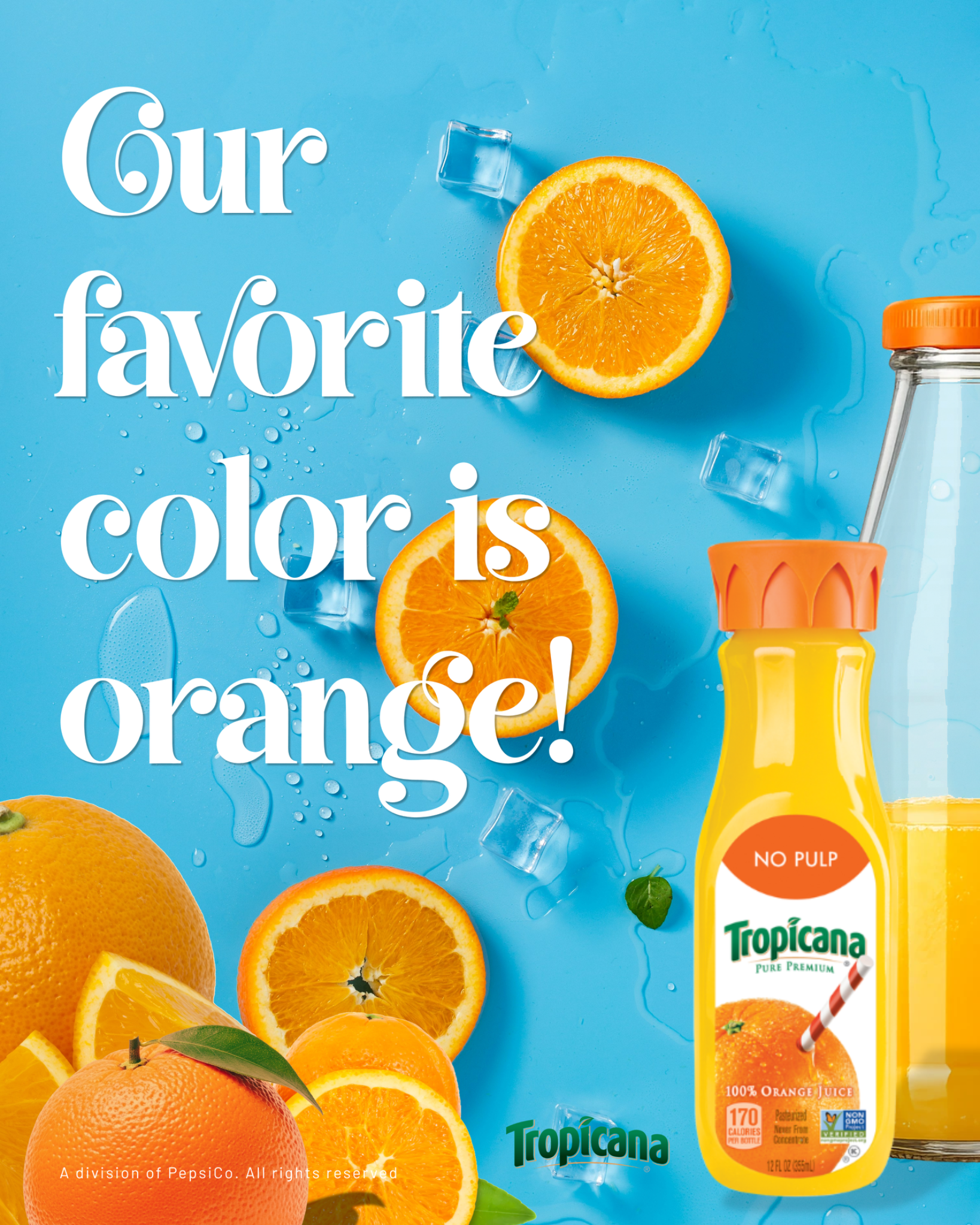
The idea: Turn the color of the product into the message.
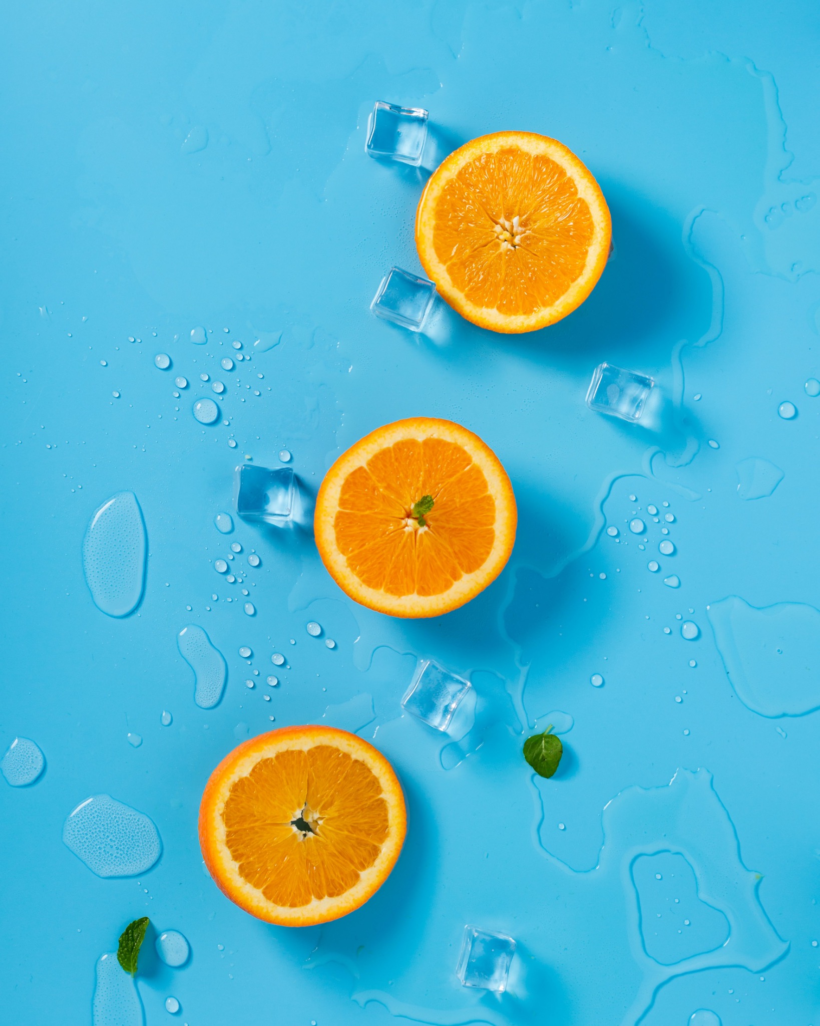
Our approach: Start with ocean blue, melting ice, and orange halves. Layer in expressive white typography, the juice bottle, fresh citrus, and brand marks.
The output: A finished beverage advertisement built around “Our Favorite Color is Orange.”

Original photograph of orange halves, ice cubes, mint leaves, and melting water on an ocean-blue background
01The starting point. Blue, citrus, ice, and water establish the color contrast and sense of refreshment. Photography: Mae Mu / Unsplash.
Finished Tropicana advertisement reading Our favorite color is orange, with white typography, orange juice bottle, citrus, and Tropicana branding
02The finished advertisement. The headline gives the image a voice. Product placement and brand marks connect the orange color story to Tropicana.

Independent creative concept by The Lenox + Yale Agency. Featured branding does not imply a commissioned relationship or endorsement.

Next case study / Rummo ↗
01 / Concept study

A little twine.

Rummo
Art direction / Product storytelling

The question: How can a familiar pantry product feel distinctive?
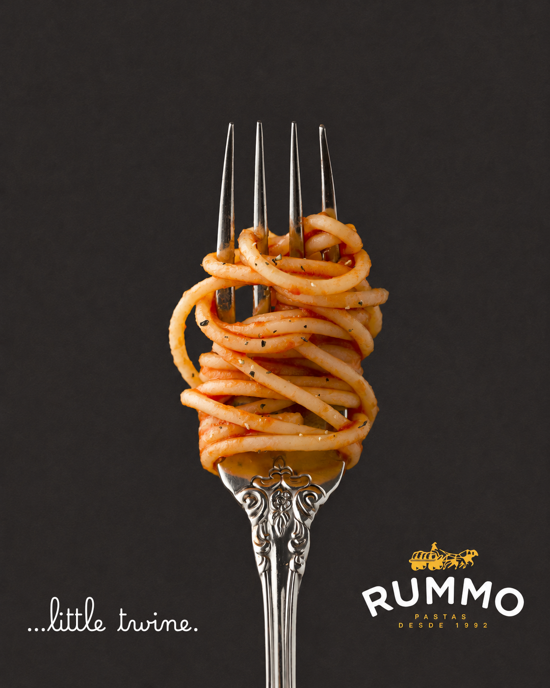
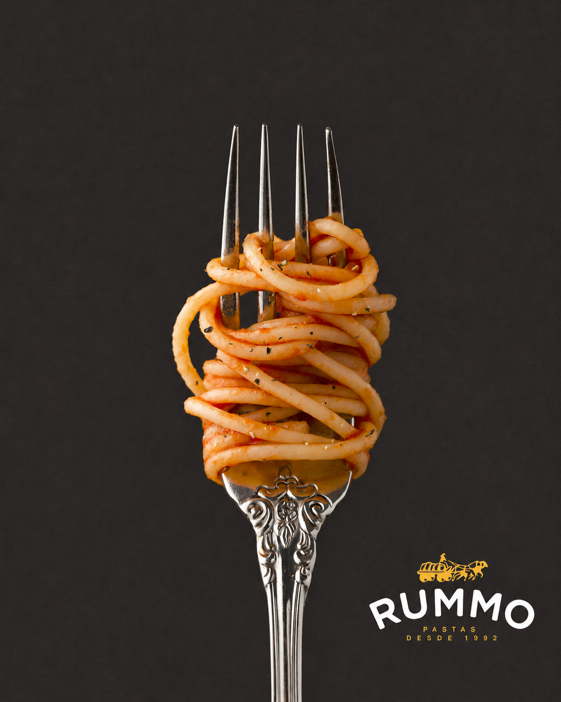
The concept: A silver fork and a single twirl of pasta make texture and appetite the story.
Developed: Art direction, headline, and two campaign treatments.

Rummo — Headline treatment
01Headline treatment. The handwritten line adds a small moment of personality to the restrained product composition.
Rummo — Product-led variation
02Product-led variation. The alternate treatment removes the headline, letting the fork, pasta, and brand mark carry the composition.
02 / Concept study

Your peace.

W Hotels
Concept development / Copy + graphic design

The question: How can a hotel communicate a feeling through one familiar object?
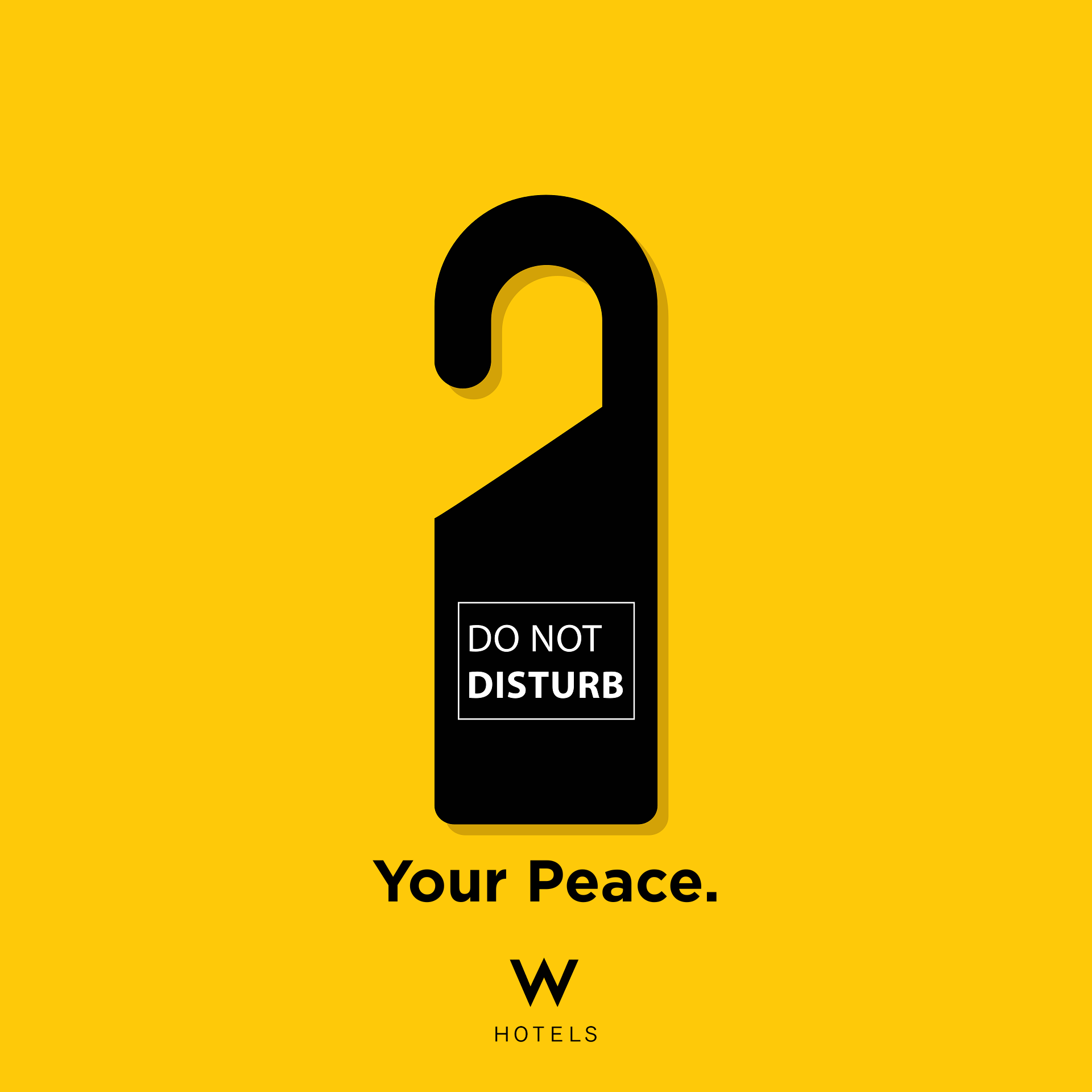
The concept: A door hanger becomes a promise of peace.
Developed: Concept, copy, and a graphic treatment for guest communication.

W Hotels — One symbol. One promise.
01One symbol. One promise. A high-contrast yellow field gives the black door hanger immediate presence; “Your Peace.” completes the message.
03 / Concept study

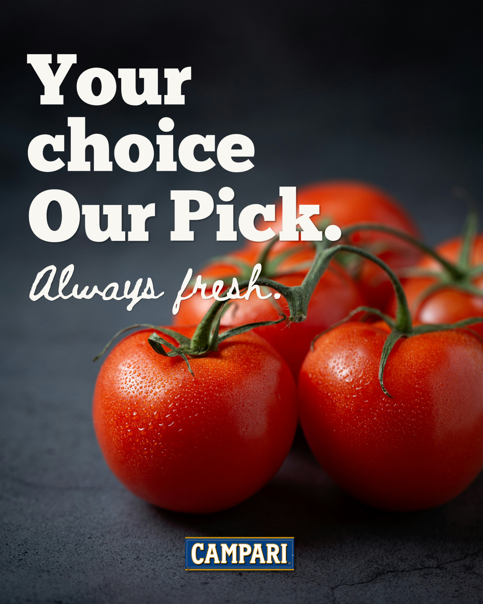
Your choice. Our pick.

Campari tomatoes
Product advertising / Copy + visual direction

The question: How can produce advertising make freshness immediately recognizable?
The concept: Close-up tomatoes and a direct headline lead with the product.
Developed: Campaign copy, visual direction, and a promotional composition.

Campari tomatoes — Product campaign visual
01Product campaign visual. Bold headline typography, a handwritten supporting line, and a tight product composition create a clear reading order.
04 / Concept study

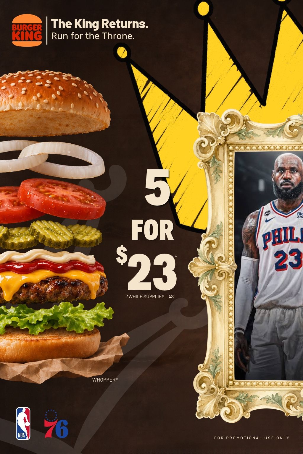
The King Returns.

Burger King
Promotional concept / Sports + culture

The question: How can a food promotion connect appetite with sports culture?
The concept: A layered burger, crown, and basketball theme frame an illustrative offer.
Developed: Promotional concept, offer hierarchy, and visual composition.

Burger King — Promotional composition
01Promotional composition. Layered ingredients and oversized offer typography create two focal points, with the crown connecting the food and basketball themes.
Capabilities

From the first thought
to the final touchpoint.

Creative concept + copy

Campaign ideas, headlines, and messages built around what your business needs to communicate.

Art direction + graphic design

Visual concepts, promotional graphics, and coordinated brand communications.

Brand identity + applications

Logo systems, visual language, and the materials that bring a brand into everyday use.

Sales + retail materials

Product introductions, sales sheets, presentations, and buyer-facing collateral.

Let’s work together

What should people
remember about you?

Tell us about your business, your audience, and what you want to achieve.

Discuss a creative project

Selected brand concepts and sales collateral by The Lenox + Yale Agency. Brand concepts are independent creative explorations; featured names and likenesses do not imply endorsement or a commissioned relationship. Offers shown in concept artwork are illustrative.